Little things can mean a lot.
Start at the top, with hair or the lack of it. That works whether you are male or female. Unruly hair that looks like a frightened rooster just won’t get it. On the other hand being expertly coifed and looking like a model may be a bit much. The key is to fit in to the comfort zone of the audience and be just one notch above it.
You want to get to trust. Trusted advisors get the contracts.
One notch better
If there is a single piece of advice in this regard, that is it. Recently, at a conference attended by top independent consultants from across the country one topic that ran through the lunch room was that clients were asking that the men not wear ties. The consensus was that was a good idea until key players in a meeting showed up in cravats!
I’ve not worn a tie since 1990 when I opened my practice. But I wear special shirts when I do a keynote that have a hidden placket and a collar that buttons tight to the neck. I have them in both black and white. My notch down is a turtle neck worn with a sport coat.
The women at the lunch table simple laughed and said the one notch above was a good idea but the way to do it was not power suits. Their advice was to have great high value accessories—scarves, purses, and most important, shoes. One noted that women knew expensive shoes the way guys know cars.
A signature item
A few of my clients have considered trying to stand out by linking themselves with key items of equipment. One was forever trading up his laptop to the smallest, lightest and most advanced until one of his clients asked how much time he spent after each upgrade learning to use it.
For awhile one client was over the moon about his expensive fountain pen until a CEO told him that he never bought a pen in his life and had no intention of doing so.
Cars, watches, airplanes, etc. Those don’t matter to most of the folks that sign the checks. They are, at best, borrowed marks of excellence. Only something that relates uniquely to you will generate the memorability you are after.
One of my clients uses a tangled skein of purple wool to visualize the money knots in all our minds when she’s speaking. The color is the same that is used in her “Untangler” logo.
Graphic consistency
I started with your appearance because the human face recognition skills far surpass our visual cognition in every other area. We are better at sensing when something is amiss then when all is okay. Other graphic elements to consider:
Color The color in your logotype needs to be the same wherever it is employed. If the color plays a major part in identifying you. It needs to be consistent. Where?
- Business cards
- Letterhead
- Website
- Signage
- Vehicles
- White Papers
- Brochures
- Presentations
- On-line Content
Typography The type style you use for your logo may be so singular that it will prove too hard to read if used for all the text in your materials. That is not always the case. The critical decision here is the selection of a single type style for all the required word elements—headlines, subheads, text, captions and even footnotes. Your mission, should you choose to accept it is to make it all easily readable.
If you tend to produce a lot of your own content there are a couple other tips you may want to employ:
- Try to keep your line length under 50 characters. Tess show that the human eye tends to tire if the line length is too long. Apparently, resetting to the next line “wakes up” the eye.
- Use flush left ragged right. Do not use the other options available in Word (Center, Flush right ragged left and Justified) All of those are harder to read.
- Multiple columns of information tends to be perceived as for business purposes.
- Eye traps (bolds, underlines, italics, bullets, lists, indents, and initial caps) can enhance read through.
- Use reverse (white type on black background) very sparingly.
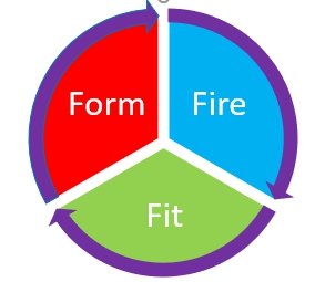
Process Diagrams I never met a consultant that didn’t have a process. Like most of us they like to have diagrams that help explain their unique approach. Too often those diagrams are drawn anew each time. Again, consistency is the most direct route to Trust.

The style of the diagram also needs to be constant. This is particularly true if there is motion or implied motion in the process. That is why I use a gyroscope as the primary overall illustration for the Z-axis Process. You can use a photo or a graphic extracted from a photo or linear graphics. Arrows can be hard-edged or brush strokes, open or filled in. Here’s a hard edged example straight out of Word
Whether you use hard edged or loose design the key is to keep it the same throughout and to use the same descriptors throughout.
Photography/Illustration Be careful to assure that your photos are all the same level of quality. If you use color photos, do so on everything (unless you have a historic black and white or tinted photo that lends credence to your “About” story) Seldom if ever should you swap back and forth between photography and illustration. Pick one and stick with it.
Most importantly, be sure all your designs look like they came from the same family. A good designer can give you a “look” that helps brand you, make you memorable and get you one step closer to becoming a trusted advisor.
Like mama said, “Mind your Ps and Qs and use consistent Visual cues!”
And so it goes.
______________________________________________________________________________

Jerry Fletcher is a sought-after International Speaker, a beBee ambassador, founder and CEO of Z-axis Marketing, Inc.
His consulting practice, founded in 1990, is known for on and off-line Trust-based Consultant Marketing and Brand development advice that builds businesses, careers and lives of joy.
Consulting:
www.JerryFletcher.com
Speaking: www.NetworkingNinja.com
