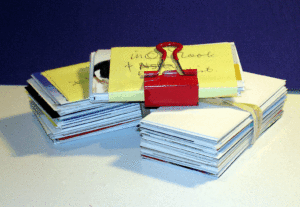
Pull one out
Reach into your pocket or your purse or that fancy carrying case and pull one out. That’s right, get one of your business cards in hand.
If you don’t have one, that is your first mistake.
I’ve heard every argument you can imagine from the adherents of the digital world about why those little bits of pasteboard are obsolete. But when confronted with the need for their people to network to build the business even one of the largest companies in that sphere relented and allowed two divisions to have business cards.
Your business card is the most basic item in your brand development toolbox.
It must answer the contact questions, sure, but look at what else you can glean from one:
- The company name may be well known, memorable or ho hum
- The logotype may tell you if the company or individual is inspired or insipid
- The title will tell you whether the person or organization is imaginative or ordinary
- The weight of the paper can influence your perception of how strong the business is.
- The colors will indicate how approachable they are
- The address, if you know the area, may tell you how solvent they are
- The positioning/tag line should tell you what they do, how they are unique, and who their product or service is for
A business card can touch three senses:
Sight is the most obvious
Touch is not considered as often but
- The weight of the paper can make a significant difference in how the person or organization is perceived.
- The slickness of the card can be interpreted as a level of sophistication
- Raised ink, once considered high quality is now seldom felt
Smell is used very infrequently. Women in fashion have been the primary users in my experience.
Look at your card. How clearly is your brand represented?
- How would you describe the name? If you are the entrepreneur/founder/owner of the business? Does it have your name in the company name? Does it include a generic descriptor? (Dot’s Bookkeeping, Feingold Financial Planning, Maxfield Marketing Counsel).
- Look at the design. Is the logo professionally designed? Is it an original based on your company’s information? Too often people go for the low-cost on-line option and wind up with a design that has been sold over and over printed on low-cost stock that is used for high print runs. Does it reflect your company? Does the perception provided the prospect meet their expectations?
- Study the positioning/tagline. Is it the same one used in other marketing materials? Are you comfortable with it? Does it naturally lead to conversations about you, the company and the products/services you offer? If you were a prospect would it separate you from your competitors?
How clear is your business card about your brand? What say you?
 Jerry Fletcher is a beBee ambassador, founder and Grand Poobah of www.BrandBrainTrust.com
His consulting practice, founded in 1990, is known for Trust-based Brand development, Positioning and business development on and off-line. He is also a sought-after International Speaker.
Consulting: www.JerryFletcher.com
Speaking: www.NetworkingNinja.com
Get all the Brand Success Stories. Sign up at http://www.brandbraintrust.com/home.html

