 Are we talking product or personal?
Yes.
People associate color with everything. Sometimes color has more impact than a symbol when it comes to establishing brand. Sometimes color is the reason someone buys one brand versus the other. It is always a part of the perception.
The choice of the primary color for your logo should not be left to chance.
How you are perceived over time is, in part, based on the color people associate with you. That may change from country to country. In America, the first preference is blue (35%) followed by green (16%), purple (10%) and red (9%) according to Wikipedia. There are similarities across cultures, too. Red is perceived by many cultures as strong and active.
How do you choose?
Test yourself.
- Get a simple set of crayons or markers that include these colors: red, orange, yellow, green, blue, purple and violet. Markers may also include black.
- Is there a color not represented by the selection you would prefer, perhaps pink or brown?
- Pick the one color that you like best.
- Pick the one you would like to use as an accent.
- Repeat steps 2 through 4 based on what you think your prospects prefer.
- Test them on real prospects. Then decide which choices you are going to use.
- Implement and stick with it.
What the choices mean in North America:
 Red: Power, Excitement, Love, Lust often used for retail as it demands attention. Wearing a red suit is a turn on for both heterosexual men and women per Wikipedia. And for the less outgoing male it might explain the ascendancy of red ties.
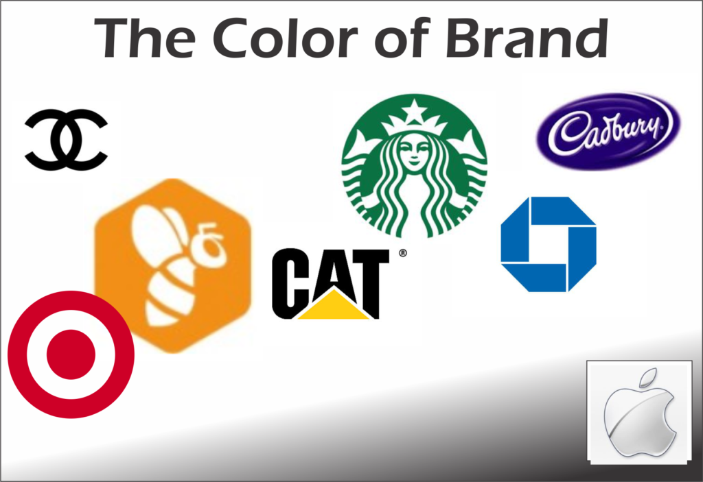
Orange: Is a combination of Red and Yellow which includes elements of each and often is considered the color of negotiation and considered action. The beBee social media platform uses the color to the max combining the full orange of a call to action button with a honey yellow for the bee drawing.
Yellow: Conveys competence and happiness (and sometimes jealousy). Caterpillar made the color a trademark on the large equipment used in construction as it is visually easier to see and then built a logo that combines a simple triangle representing a bulldozer combined with the shortened name which most users call the company. Hertz used it to “put you in the driver’s seat.” And before Google we “let our fingers do the walking” through the Yellow Pages.
 Green: Generates a perception of good taste (and sometimes envy). Starbucks is an obvious choice to demonstrate the power of green. But John Deere has made another shade of green all their own painting all the farm equipment they manufacture in a color you can identify easily out in the fields
Blue: Tends to be seen as masculine, corporate, competent and high quality. Banks, like Chase, tend to use shades of blue from the deepest to the lightest hues. But sometimes combined with a light touch, a light blue can take on a different character. Think of Twitter.
Purple/Violet: Most Americans have difficulty identifying these two colors. Their perceptions are relatively clear however. Authority, Sophistication and Power is what they believe these colors reflect. Cadbury, the candy maker is considered an authority in making chocolate confections for sophisticated tastes. Hallmark, the greeting card company also has a purple logo.
There are four other colors that have become dominant in logotypes.
Pink: Is viewed as feminine, sophisticated and sincere. And the color is used to promote products to women from Barbie to Victoria’s Secret. But is also used to promote insulation that is pink and is the in your face shade of that small rabbit incessantly pounding a drum in commercials to demonstrate how long Energizer batteries last.
 Brown: Rugged and Dependable. United Parcel Service (UPS) chose this color at least 50 years ago. I’m not sure they didn’t make people think this way about the color.
And don’t forget…
Black: Stands for sophisticated and expensive. It is also the color of fear and grief. Any person or organization that sells in the high end should think hard about using black as the primary color in their logo. It has been used by everyone from Coco Chanel to Mercedes to the Beatles to Air Jordan.
White: Happiness, Sincerity and Purity. Look in to apple ads and materials. They have made white a signature color.
What should you pick?
Find the color you are comfortable with that is acceptable to your clientele. Remember that the general perceptions of color are often overcome by time. Your choices should all be based on making you memorable and being simpatico with the actions you take that make you trustworthy. Good luck!
 Jerry Fletcher is a beBee ambassador, founder and Grand Poobah of www.BrandBrainTrust.com
His consulting practice, founded in 1990, is known for Trust-based Brand development, Positioning and business development on and off-line. He is also a sought-after International Speaker.
Consulting: www.JerryFletcher.com
Speaking: www.NetworkingNinja.com
