Don’t Hold Your Breathe About Web 3.0

The advent of Web1.0 was about the time I opened the doors on my consulting business.

That was in 1990.

I built my first web site using something called Frames.

Don’t ask. All I can remember about it is the name.

Somewhere between 2004 and 2008 Web 2.0 cane to life.

It is the one we live with today. It is the reason that Google and Facebook and Linked In exist.

Web 3.0 will put artificial intelligence and blockchain technology to work doing what is now done by massive server farms controlled by the largest technology companies. Because it is distributed across many devices it is believed to be safer with regard to individual’s data.

Your old URl won’t connect to Web3.0.

Numerous blockchain domain name service (DNS) systems have emerged, including Ethereum Name Service (ENS), Unstoppable Domains, Decentraweb, and Handshake.

You will have to create a Web 3.0 web site.

Your current web pages can have a link added to get to the new site, but web 2.0 and 3.0 are not compatible. And, oh yes, you will have to set up your browser to access Web 3.0 domains.

You will have to create a wallet and funding to work in this Blockchain World.

That is after you learn how different this new world is and understand: Web3 domains are multi-utility NFTs (non-fungible tokens) or “digital certificates” that are publicly transparent on the blockchain. As unique assets, Web3 domains act as a gateway to decentralized websites and applications, alongside providing a convenient way to send and receive funds.

Unless you are a major corporation it is way too early to think about implementing 3.0.

Like I said, Don’t hold your breath.

And so it goes.

.

Jerry Fletcher is an international professional speaker/

.His work with elite consultants from Singapore to Spain guides them to build their business, their brand and a life of Joy.

He helps individuals and organizations become more memorable and more profitable.

Consultant Marketing Website Time

Every marketing conversation I have with a consultant sooner or later gets around to their website. The status reports I’ve hard in the last week fit into these untidy categories:

  • “I’m between an old one and a new one. I just can’t seem to wrap my mind around the right words.”
  • “I really haven’t looked at it for a while, besides I don’t get any business that way.”
  • “It needs work, but my webmaster keeps telling me she can’t write for my audience and I just don’t have time and I can’t find anyone who can.”

For consultants it is always time to work on their web site. Always.

Lack of Consistency

When I review sites for clients I find one overwhelming problem, a lack of consistency.

The website is inconsistent in its overall viewpoint floating back and forth between being all about the Consultant, his or her process and certifications and the problem to be solved.

Then, too, there is no consistency with their social media profiles, particularly Linked In.

The wrong conversation

Most believe a website should answer the question, “What do you do?”

WRONG!

The question you should be answering should be “What can you do for me?”

That simple shift will allow you to find the right words, the ones that will generate business and a way for you to evaluate a writer for your site.

Time is not on your side

ProBrandr , the way you can inject your Brand into your Linked In profile in just one evening is based on over 25 years of monitoring how people respond to on-line postings. Time is not on your side. Here’s how things stack up for your website:

Panel 1: You have 3 seconds to tell the kind of people you work with what you can do for them. Here’s what I say:

“Consultant Marketing and Brand advisor

I guide consultants and consulting organizations to become
more memorable and more profitable.
503 957-7901”

The statement you make here should:

  1. Identify the clients you work with
  2. State the outcome(s) you deliver
  3. Give them a way to contact you

Everything else you say on that panel is extraneous. Yes, you need navigation but that is not considered informational in and of itself.

Profitable point of view

Your website should be all about clients and client outcomes. Consider including outcome information directed to each audience you serve, client testimonials, information about you and your team and a way for prospects to contact you.

The question they want an answer to is “What can you do for me?” They are looking for someone who has the expertise to solve their problem for a reasonable fee in a way that is understandable to them, and won’t upset staff and operations.

Your Website should make them feel comfortable in contacting you, not to be pitched but to be listened to.

And so it goes moving from Credibility to Cash.

Jerry Fletcher is a sought-after International Speaker, a beBee ambassador, founder and CEO of Z-axis Marketing, Inc. See Jerry’s speaker demo reel.

His consulting practice, founded in 1990, is known for on and off-line Trust-based Consultant Marketing advice that builds businesses, brands and lives of joy.

Credibility to Cash TM is his latest way to share experiences so you can take your business up a notch…or two.

Consulting: https://www.JerryFletcher.com
Speaking:  https://www.NetworkingNinja.com Product: https://www.ProBrandr.com

Consultant Marketing Website Panel 1 Options

Can your home page first panel pass the three second test?

Three seconds is all you have for your brand to register with a visitor. That visitor is like a stranger you’re meeting for the first time as you’ll see in this video https://vimeo.com/351932771

The first panel on your home page must get across:

  • Who this is for
  • What problem it solves
  • How to take action

Dissecting the panel I have in development.

The navigation bar is often not streamlined to make that first glimpse as powerful as it might be. You need to have your logo up there in the upper left. Make sure it is clickable. That way you don’t have to put “Home” in the navigation.

Keep the pages listed to an absolute minimum. You can use the footer for all the wonderfulness that proves you know your stuff.

Put a call to action button at the far right. If you are lucky to catch someone at the point they are willing to make an interactive commitment you want to make it as easy as possible for them.

You’ll find I’ve followed my own advice. Here is the first option:

Option 1

Background Image is usually the first thing people see. We are, after all, visually oriented. The image should give us the idea of what the shift is like on the other side of your advice.

It is the kiss at the end of every romance movie ever. It is the celebration of a team. It is the fond hope of the target audience.

Here is the first alternate. Notice how the copy and the photo play to success.

Option 2

Headline is where things get tricky. We need to get the unique difference across in just a few words. You need to consider these things: 

  1. Awareness level of most visitors. Are they aware of the problem you solve? If not, that is part of your job here. Are they aware of solutions? If so, you may want to offer a comparison to a known solution. But if they are well along in the customer journey and already aware of your brand you need to find a way to engage more personally with them
  2. The job to be done. What, in their terms is the job they need to get done that you or your product/service might do for them. How you refer to what you do needs to be in terms of, “Here’s what you can do with our product.”
  3. What it’s worth to the prospect plays a key part in how you will be perceived. If you have a value proposition for your business this will be an integral part.

Here’s an option that might play better with women. Note how the headline has been shortened.

Option 3

Subhead is optional but I highly recommend it. It gives you the chance to add to the value of your headline, expand and define the job the product does and personalize your pitch for the target audience. The more these words come out of the situations your prospects find themselves in the stronger they will be. The more you can let them see you understand the emotional context they find themselves in the more they will be drawn to you.

Notice how the subhead has changed slightly to include the phrase “lifelong success” which is gender and age neutral as illustrated by this example:

Option 4

Call to action (CTA) After all that skull sweat to find just the right words you can’t let it go to waste. You can’t expect the visitor to know what to do if you don’t tell him/her. You don’t need to put your primary CTA on the first panel. But you do need to put at least one simple button there that is the overall action you want folks to take.

You need to give the visitor a simple mechanism to connect with you. In the case of the Master site we have button in a color contrasting from the background image with the words Arrange a Chat. That drops down to the primary home page CTA that is a form that gathers additional data about the prospect. Why? I’ve written before about “Skin in the game.” If a prospect will answer a few questions they are more likely to be someone I’d like to work with.

Here’s a tip: include a second CTA but make it not as prominent. Offer the visitor a less direct close. Give them an option.

This is glimpse into the thinking and development process I use with every website. This is just the first panel on my new site in development. Which design will I launch? Right now, I’d probably go with the old guy version. Which do you prefer?

And so it goes

_____________________________________________________________________________

Jerry Fletcher is a sought-after International Speaker, a beBee ambassador, founder and Grand Poobah of www.BrandBrainTrust.com 

His consulting practice, founded in 1990, is known for on and off-line Trust-based Consultant Marketing and Brand development advice that builds businesses, careers and lives of joy.

Consulting: www.JerryFletcher.com
Speaking: www.NetworkingNinja.com

What Are the Key Words of Your Brand?

.

That sounds simple enough but as my client Brent said over lunch, “Finding key words takes a lot of time and you’re still not certain they match up with your brand.

Search engines are dumb.

Type in a descriptor of what you are looking for.  For example, I’ll use “keynote.”

I mean a major presentation by a professional speaker at a meeting or conference. But that is not what Google served up. All I got initially was a lot of information about an Apple program. It took three pages before I found any item about a professional speaker!

Maybe not so dumb…

I changed the query to “Keynote speaker.” That yielded 62,800,000 possibilities and the first page was all about professional speakers and speakers bureaus.

I started looking at how to get really good key words because “keynote speaker” got a lot of possibilities. Way too many!

Key Words are competitive

As you minimize the competition for your key words you increase the possibility of your web page showing up on the first page of the search engine. That gets you up to 90% more views!

Popular search terms only make up a fraction of all searches performed on the web. In fact, keywords with very high search volumes could draw visitors to your site whose goals don’t match the content your page provides.

Long tail key words may be more valuable

This chart from MOZ shows how key words ranked outside the top ten provide over 80% of the searches.

Test and Reset.

Finding key words that match your brand is an iterative process. Trial and error can get you to a better place. I started with: “Keynote Speaker for Independent professionals”

That generated zero, zip, nada so I tried:

Keynote speaker for Consultants 77,100,000 results
Keynote speaker for Coaches       72,000,000 results
Keynote Speaker for entrepreneurs         20,100,000 results
Keynote speaker for solopreneurs           59,100 results

Get more specific.

Since I speak on multiple areas of business development essential to these kinds of businesses I next tried searching based on those possibilities. The results:

Brand Keynote speaker      30,300,000 results
Brand Keynote Speaker for entrepreneurs         9,550,000 results
Brand Keynote speaker for solopreneurs                        87,000 results Networking keynote speaker          11,700,000 results
Networking Keynote speaker for entrepreneurs 12,700,000 results Networking Keynote speaker for solopreneurs  97,500 results
CRM keynote speaker         801,000 results
CRM Keynote speaker for entrepreneurs           410,000 results
CRM Keynote speaker for solopreneurs            39,800 results
Brand keynote speaker for solopreneur consultants     204,000 results Networking Keynote speaker for solopreneur consultants 136,000 results CRM keynote speaker for solopreneur consultants       28,900 results

Focus

Deciding what to do is damned difficult. Trends say there is more interest in brand than networking and definitely more than in CRM. But, the smaller the niche you approach the easier it is to get high search rankings and hence bookings. It looks to me like I should put more emphasis on my speaking site on CRM or possibly crank up a new site.

What do you think?

Jerry Fletcher is a sought-after International Speaker, a beBee ambassador, founder and Grand Poobah of www.BrandBrainTrust.com 

His consulting practice, founded in 1990, is known for Trust-based Brand development, Positioning and business development for independent professionals on and off-line.

Consulting: www.JerryFletcher.com
Speaking: www.NetworkingNinja.com
DIY Training: www.ingomu.com

Step Away From That Social Media Suckhole

Social Media SuckholeJim said, “One of my clients was talking about his experience on FaceBook. It seems he has looking for a high-tech app for his company, saw an ad on FaceBook, clicked on it and within 15 minutes someone from the company was calling him.”

He told me that he suggested the CEO turn it around and use it for his own company.

Then he asked the wrong question!

No, I said, you should not be advertising on FaceBook. And you should not think about LinkedIn or Google either. The reason is simple: That is not the right model to build your business.

Until the customer/ client/ patient gets access to your product you don’t have a business.

Service Businesses require someone to provide “hands or minds on” actions. There is direct contact.

Product Businesses make an item that can be used but the company may or may not have direct contact with the end user.

Combination businesses make products and provide services associated with those products usually but not always directly. Their passage or physical distribution may be direct or through several intermediaries.

Distribution businesses provide physical distribution of products to end users or resellers such as retail outlets. The most common are independent distributors and wholesalers. The amount of inventory they carry varies across a full spectrum.

Agent/Broker businesses sell products or services to end users but may not handle physical distribution. Most independent salespersons fall in this category. Frequently they handle several lines that are used in an industry but are not directly competitive.

What is the right model to build your business?

  • Consultants and Professional service providers usually do best when they use tools that generate referrals
  • Business to Business B2B organizations that offer services need a combination of promotion, referrals and a sales force that connects with customers efficiently
  • B2B organizations that offer products at low cost may orient more to advertising and telephone follow up like Jim’s client experienced. The controlling factor is the cost of the products offered. Higher priced products generally require a more knowledgeable sales person and sometimes the best solution is an engineer partnered with a salesperson.
  • Business to Consumer B2C companies have the broadest selection of distribution possibilities that run the gamut from direct sales to distributors, wholesalers and retailers. But here, too, the price of the product being offered will have significant impact on the level of salesperson required.

Do you or a competitor have a way to change an industry?

Examples abound: Amazon, Lyft, Driverless Cars, Disney’s Magic Band access to hotel and park, Airbnb and a host of Internet of Things (IoT) applications that may not have existed last week.

You need to think about how FedEx technology adaption forced UPS to leapfrog them. Can you do something like that? No matter what your product or service, you can, if you think it through, make your offer in such a way that it stands out form the crowd.

That’s when Social Media fits in.

Use the social media platform that gets you the most exposure within your target audience at the lowest cost until you move on to pay per click advertising. Hire a professional organization that makes a living doing that. You will save yourself time, pain and money in the long run. But first, make sure your landing pages and website support your Mission, Position and Value Proposition.


Jerry Fletcher ThinkinigJerry Fletcher is a beBee ambassador, founder and Grand Poobah of www.BrandBrainTrust.com

His consulting practice, founded in 1990, is known for Trust-based Brand development, Positioning and business development on and off-line. He is also a sought-after International Speaker.

Consulting: www.JerryFletcher.com
Speaking: www.NetworkingNinja.com

Deja-vu Testing for On-line Success

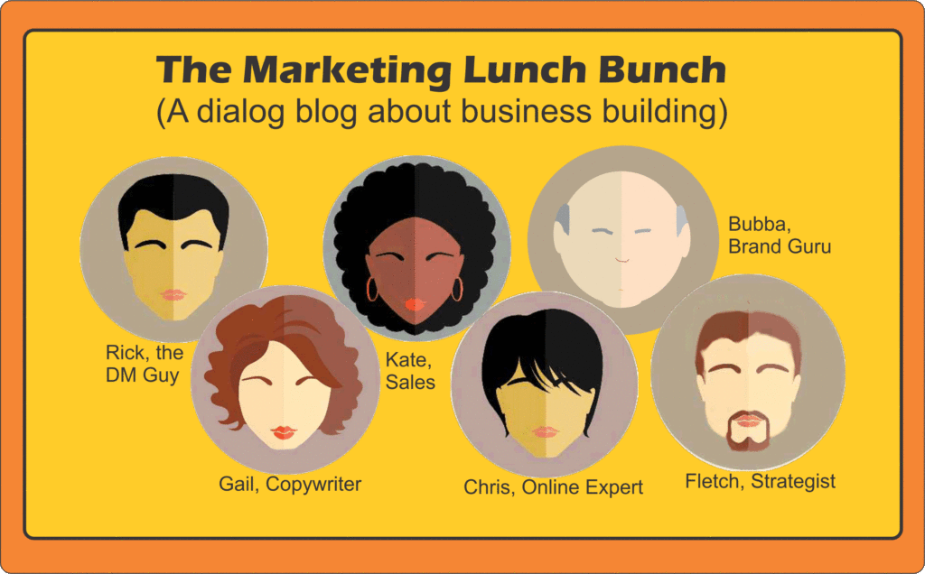
The Marketing lunch bunch“It’s not a new idea” Kate said, “So don’t try to take credit.”

Rick groaned, took another sip of wine and nodded. Then he rose to the bait saying, “I know I didn’t invent the idea but at least give me credit for figuring out how to apply it to the funnel hacking e-marketing world we live in.”

“So what brilliance did you come up with?” I asked.

“Daily déjà-vu of simultaneous synchronized multi-variant testing of multiple elements is my claim to fame,” he said.

Gail guffawed looked him in the eye and said, “What a mouthful! Rick, my boy you are brilliant at times but this is not one of them. You know as well as I do that direct marketing copy controls have been tested every which way you can imagine over the years and that something as simple as an A-B split test is so easy online that anyone that can afford the software or the service can get it done. So what are you claiming?”

Kate piled on noting, “And don’t try to pull that tale of having to dumb down your ideas of how to test that the programmers couldn’t figure out 10 or 15 years ago because Fletch was sitting beside you in that meeting you’ve told me and as I recall he’s the one that had to explain what an A-B split test was.”

Rick swished his wine in the glass, carefully set it down and replied, “You all would agree that we need to find out the relative importance of the offer, the list of people you are addressing and the approach. That principle is true of direct marketing, e-mail marketing, e-commerce stores/catalogs on-line or even a web site developed to begin a relationship for a professional service.

My approach takes the ability of the internet to produce quantifiable data quickly and the need to look a multiple components of the message to new levels. There are entrepreneurs out there right now that are pushing the envelope. They test everything. They find a control that works and then start testing to improve it. Sometimes as simple shift can increase ROI by hundreds of points.

What are you doing to make your web-based marketing activities more successful? Why not try tests of formatting, subject lines, subheads, arrangement of paragraphs, captions, descriptions, addition or deletion of photos and a host of other variables. There is hard data that shows that at least half of these have increased response levels.

The time to test what works for your business is right now. And tomorrow. And the day after.

Testing ought to be Deja-vu, over and over again.”


Jerry Fletcher weaves the tales of the Lunch Bunch based on his experiences in advertising, direct marketing, consulting and helping build entrepreneur businesses.

Jerry Fletcher KeynoteJerry Fletcher is a beBee ambassador, founder and Grand Poobah of www.BrandBrainTrust.com

His consulting practice, founded in 1990, is known for Trust-based Brand development, Positioning and business development on and off-line. He is also a sought-after International Speaker.
Consulting: www.JerryFletcher.com
Speaking: www.NetworkingNinja.com

Get all the Brand Success Stories. Sign up at http://www.brandbraintrust.com/home.html

Form With A Personal Touch

“It all comes down to your form, “I said.

“Are we talking golf or Tennis? “ Chris asked as he sat down.

Getting Subscribers

“Neither” said Rick, our direct marketing expert. “We’re talking forms for web sites and landing pages and other uses on line. One of Fletch’s clients was unhappy that he recommended that a form to capture visitor e-mail addresses be included on every page of the website. The client argued that it wasn’t classy and interfered with his branding.”

Chris, our digital director in residence, turned expectantly to Rob the Branding authority in our midst and said, “So the branding viewpoint is….”

Bubba didn’t disappoint him. “Son,” he said, “That feller’s got his knickers in a knot for the wrong reason. Heah’s the thing. You got folks comin’ to a website and the reason they are there is to find out some more about you or your product or service. They may be looking to meet you. If you were dealin’ with them in person what would you do? You’d make it as easy as possible. You’d answer their questions. You would try to connect with them. You’d invite them to keep in touch. That means the form has got to be there but:

  • The form needs to fit in with the personality of the site
  • The design should emulate the rest of the site
  • The language should fit in with the rest of the site

Kate, our sales veteran took over. She said, ”If you think of the form that way you treat it less like a form and more like an invitation. You tell people what they are going to get and you treat them with respect. You make your approach more personal. For instance, instead of having a button that says Submit you use language like ‘Sign Me Up’ or ‘Connect Me.” (Here’s an example)

“Limiting the amount of information they have to supply is important in that situation,” said Rick. “The other thing you have to tell them is that you won’t sell or give away their information to anybody. Of course, there are other kinds of forms. Those need to include Bubba’s rules but forms that are designed to detect digital body language or for gathering more information such as an application need to assume a couple things:

  • The fewer the queries the better. (Try to keep it under 7)
  • Make it as simple as possible for the visitor
  • Consider gathering information sequentially to build up a prospect profile for multiple interaction situations
  • Put your labels above the fill-ins
  • Use Drop down menus to conserve the visual space of the form
  • Use checkboxes to allow selection of multiple values at the same time
  • Use radio buttons where applicable to allow for faster viewer scanning.

“If I bring my client to lunch will you guys repeat yourselves?” I asked.

Gail, our writer/editor quietly spoke for the group saying, “You’re big boy. You can convey what was said here today. “What I hear you saying is that you’re not sure you can convince your client. Try telling him what you learned.”

The Takeaway:

Forms on web sites, landing pages and sales sites are all better when they are built with a personal touch in mind– like an invitation. That means designing the form to fit in seamlessly while making it as easy for the user as possible.

Jerry Fletcher’s blog recaps conversations with clients, prospects and the unruly mob of business development professionals he consorts with. They discuss marketing that works from solopreneur to enterprise level. Jerry Fletcher is the ringleader and “Watson” of the dialogue.

Jerry has been researching and implementing small business marketing that builds businesses, careers and lives of joy for 25 years as President of Z-axis Marketing, Inc. Learn more at www.JerryFletcher.com

Schedule a personal appearance. Jerry speaks internationally on Networking, Marketing and Contact Relationship Magic. www.NetworkingNinja.com

Why Tech is Wonky

Gail slammed her purse down and said, “I tell you all I am sick and tired of just getting to understand a piece of software and they up and change it!

Interface frustration“Now what?” said Chris, our digital director.

“My assistant simply clicked yes to an upgrade on the blog software and it went all wonky. There is no way to edit new posts on it now,“ Gail replied. She continued, “I write and I edit and I always review the post before we publish it. Fat chance at the moment.”

“Thas not the only thing goin’ on at the moment said Rob, the Georgia peach of branding. I understand that the new Google change is driving people that understand this SEO thing kinda crazy, too.”

“You’ve got a point Bubba,” I chimed in. “But not everything is worse because of changes. I upgraded to a new I-phone and I have to tell you the interface is a whole lot easier to use. But I still think they should give you some sort of instructions with the darn things. Those of us that haven’t grown up using them to take photos and e-mail them plus push those apps around could use some help. Besides, I’ve got big thumbs.”

Kate our sales specialist smiled and asked, “Can I join this pity party?”

“Jump in,” said Bubba.

“The thing that gets me is how different all the contact managers I run into are,” Kate continued. “They’ve been around since the 90s and you would think that how to make them easy to use would have been figured out by now. Every time I go into a company to tune up their sales operations it seems like I’m dealing with a new way of doing the same thing. It starts with trying to upload a list of contacts and goes downhill from there.”

“I can tell you part of the problem,” said Rick who runs a world class direct marketing operation. “A lot of software is written by folks in new companies. They try to make theirs look and operate differently from the competition. There is no previous version to narrow their approach and there is no best practices to look at. On top of that they are engineers who seldom if ever try to think like an end user. The result is that we users have to adapt continually to the bizarre solutions they come up with.”

“All y’all got that right. Every time I get told about an upgrade I know I’m gonna be outa kilter for a while, said Bubba.

“The thing is,” I said, “there’s a whole science to this stuff that nobody ever seems to look at. It’s called User Interface Design. It all comes down to the fact that users just want to be able to solve their problem quickly and easily in the same way from software to software. They want engineers to stop thinking they are creative geniuses and start building stuff that is easy to use.”

You and me and all of us should think about that as we develop our trainings and products. If we stop reinventing the wheel we might get there faster.

The Takeaway:

Truly great user interfaces are the ones that are engineered to stay out of the way.


Jerry Fletcher’s blog recaps conversations with clients, prospects and an unruly mob of business development professionals. They discuss what’s new, what’s old, what’s good, bad and ugly plus creative thinking to find what works. Jerry Fletcher is the ringleader and “Watson” of the dialogue.

Jerry has been researching and implementing small business marketing that builds businesses, careers and lives of joy for 25 years as President of Z-axis Marketing, Inc. Learn more at www.JerryFletcher.com

Schedule a personal appearance. Jerry speaks internationally on Networking, Marketing and Contact Relationship Magic. www.NetworkingNinja.com


Passion of Pursue

Passion of PursueI said, “A Linked-In contact in the Middle East described her ongoing education saying, “rather than pursuit of passion, I like the Passion of Pursue :).”

Gail, our writer, replied, “The tenses and words are all twisted around but there is a beauty in the comment.”

Rick, ever the practical direct marketing guy surprised us all saying, “There is something magical in what she is observing.”

“Magic?” questioned Rob.

“Magic.” Said Rick. “All of us spend our days working on ways to build our client’s businesses. They expect us to be passionate about it. But we can never be quite as passionate as they are. And as much as they think that for us it is all about the money. It isn’t.

For us the passion is in what we are doing. It is about psychic rather than physical rewards.”

Surprisingly, Kate, the tough sales consultant was nodding in agreement.

“How often,” she said, “have each of us admitted that we would do what we do even if we didn’t get paid for it. Ours is the passion of pursue… getting it done, making something happen, wanting to make the world a better place.”

“That reminds me of Steve,” I said. He was flat broke when he came across an article in the paper. By the time he realized what was happening he had started what will become a charity. It has a crazy name: Carbon Sucking Trees. Take a look at the website. He’s done all this work with no hope of a personal payback. It’s the Passion of Pursue.”

Carbon Sucking Trees,” mused Rob, our branding guru. “That is one of the weirdest brand names I’ve ever heard. I’m not going to ask, I’ll just go to the web site and figure it out. But I have to tell you this playful approach to words is one of the techniques commonly used to position and brand products and services. Here are some examples:

  • Famous:           The Uncola for Seven Up
  • Not so famous: The Untangler for Shell Tain a money consultant who is one of Fletch’s former clients
  • Sorta Famous: Digimarc (the name Fletch came up with for a “digital watermarking company”
  • Not so famous: KDI Americas (Fletch suggested adding the ‘s’ to broaden the scope of a company already known in Asia and Africa which was moving into this hemisphere. It worked.

I responded, “Bubba, you are kind to use examples from my portfolio. I do appreciate it. But I’d like to get back to what Rick and Kathy were saying. I agree that the true professionals in business development do it for more than the money. They are passionate about it, but it is the results that gets them involved.”

Chris, the digital director said, “Then how come the very best cost so much more than others?”

“They do and they don’t,” I said. If they are good at what they do, they are always working. They have less time and because of that they raise their rates. And the world knows they are good at what they do and more people are eager to work with them. That cycle repeats and repeats. But they are still intrigued and if you can lay a problem in front of them that gets their interest the price to you might not be as high.

The Takeaway

Don’t be put off by your fear of the cost of an expert. That expert may get you answers much, much faster. More importantly, if your problem is intriguing they will give you value in multiples of what you pay. And, should you catch them at the right time, their advice may cost nothing yet be the best you will ever receive because theirs is the passion of pursue.”

The lunch bunch is a group of marketing and sales professionals that meet for lunch each Friday. They discuss what’s new, what’s old, what’s good, bad and ugly but mostly what works. Jerry Fletcher is the ringleader and the one that writes up their comments. Sign up to get updates on all their discussions at www.JerryFletcher.com/profit


Jerry Fletcher has been researching and implementing marketing that builds businesses, careers and lives of joy for 20 years as President of Z-axis Marketing, Inc. Learn more at www.JerryFletcher.com

Schedule a personal appearance. Jerry speaks internationally on Networking, Marketing and Contact Relationship Magic. www.NetworkingNinja.com

How To Do A Home Page Video That Builds Business

Chris, the digital marketing director said, “The websites you build videos into keep people on the site longer, get better click through and higher signups. I want to know why.”

Video can hook people on your website“Yeah,” Kate said, “Tell him the formula, Fletch.”

“It’s simple, I replied. “It’s a combination of selling like Kate coaches people to do and a marketing trick I’ve learned over the last 25 years. All you have to do is make a video of your 30 Second Marketing conversation.”

Gail asked, “Is that the thing you came up with to replace elevator pitches?”

“Yes,” I said.

She continued, “The one that is intended to answer the question what do you do?”

“Yup. The answer is what I call a hook. The four elements of the formula are:

  • Hook ‘em
  • Hold ‘em
  • Pitch ‘em
  • Close ‘em

Rick said, “I’ve heard you speak on this. As I recall the hook is hard to come up with but once you’ve got it you’re more memorable and people want to talk to you if only to find out more about you… but that’s in person. A video on a web site is more like direct marketing and that is my bailiwick. How does this work there?

“Hooks can be found or developed in a lot of ways, I said. Here are just a few that have worked for me with clients over the years:

  1. Review customer testimonials for simple descriptions
  2. Try to put what you do in terms a first grader could use to explain what you do to his or her classmates.
  3. Think about what you do from the customer’s viewpoint. What problem do you solve for them?
  4. Put it in words that will force them to want to know more.

“But y’all got to be careful of your brand,” said Rob, our branding big brother. “You can’t say something that is gonna hurt you long term even if it gets their attention today. I reckon tha’s wheah the rest of the formula fits in, right?”

“You’re right Bubba,” I said. “the hook is what everyone remembers but what makes 30 Second Marketing TM work is the rest of it. In order to hold ‘em, you have to find the words that come after You know how That means you have to know the problem that brings your ideal customer to you. When I train people to do this I try to get them to know the top three problems that their ideal customers are trying to solve. The pitch always starts with the words What we do is… and then explains how you solve the problem for your ideal customers. The close is a specific Call to action.”

“And, Y’all don’t want to be flappin’ your gums too much either, said Rob. Make it quick. If you go much more than a minute and a half they’ll be gone faster than a fox when a beagle bays.


Jerry and the marketing lunch bunch will be back next week. Their discussions are always about small businesses marketing tips that are low or no cost.

www.JerryFletcher.com is Jerry’s consulting web site He meets around kitchen and boardroom tables to change the marketing of companies in the Americas. He prefers working with “Little Guys” with 1 to 500 employees.

www.NetworkingNinja.com is his speaking site. He speaks professionally on three continents on how to craft Trust-based marketing that builds businesses, careers and lives of joy…on and off line.